Period window
|
Regular Period Windows A Peranso Period Window (short PerWin) is used for drawing the results of a period analysis, and for doing extensive period analysis work. The abscissa (X axis) of a Period Window displays the time or frequency range over which the period calculations have been made. The choice between time domain or frequency domain is made at the start of a period analysis calculation. The default base time in Peranso is days, which is more typical for variable star work. A user can switch the base time to hours, e.g., when making asteroid period calculations. The choice again is made at the start of a period analysis calculation. The ordinate (Y axis) of a Period Window displays the calculated statistic of the selected period analysis method, or the power spectral density :
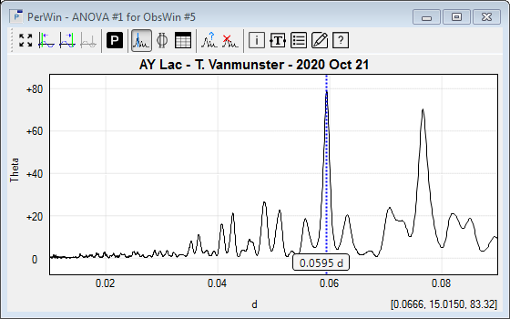
The label [0.0666, 15.0150, 83.32] at the bottom right part of the below figure displays the mouse coordinates and consists of 3 parts:
Period windows often show a Frequency cursor to locate dominant periods (peaks or valleys) in a Period Window.
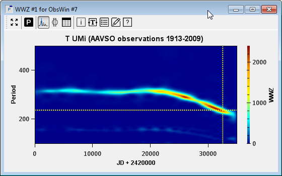
The toolbar in the upper part of the Period Window groups frequently used PerWin commands. Almost all graphical properties of a PerWin can be modified by the user. This includes axes titles, the mouse coordinates label, the PerWin title, and so on. Left click the mouse on the label of interest to modify the label text. Right click to change the font and color. Not all peaks (or valleys) in a Period Window correspond to true periods : some peaks arise from aliasing, others may be harmonics of the main (fundamental) frequency, etc. Even if a period is a true period, it may not be significant. Peranso offers a series of tools to try to distinguish true periods from artifacts and to determine the significance level of a period. WWZ Period Windows If you select the Weighted Wavelet Z-Transform WWZ period analysis method, Peranso will display a Period Window that looks substantially different from a regular Period Window. The WWZ period analysis method is a time-frequency analysis method, exploring both the frequency domain (as any Period Window does) and the time domain. While a regular Period Window is a plot of some response (e.g., power) as a function of either time or frequency, a WWZ Period Window produces output for a range of frequencies and time. Hence, a WWZ Period Window plots the response as a function of two variables, and therefore is a 3D plot, where the X axis represents time, the Y axis represents frequency, and a color (Z axis) is used to plot the WWZ response. Such plots are often referred to as Color maps. The WWZ period analysis method is an excellent tool to study period evolutions over time. Let's consider the below example, which shows the period evolution over a range of 96 years (1913 to 2009) of the variable T UMi, based on observations submitted to the AAVSO International database, and calculated with the WWZ method. On the X axis (time) we see the Julian Date, while the Y axis shows the range of periods over which the WWZ calculation has been performed, based on input values provided by the user. In this example, we have performed a WWZ analysis for a range of periods between 100 days and 500 days. The calculated WWZ values (responses) are represented by a color scale, which you see at the right hand side of the Period Window, having values ranging from 0 (dark blue) to 2400 (brown). Different color scales are provided by Peranso.
The WWZ Period Window clearly demonstrates that the period of T UMi has not been stable over time. Initial observations (near JD 2,420,000) yield a period around 316 days, which remains somewhat stable till JD 2,440,000, but then strongly decreases, reaching a value of 221 days near JD 2,455,000. The most dominant period in the WWZ Period Window is represented by the 'highest' color of the color scale, and in the above example is reached near JD 2,452,500 with a value of 237 days and a WWZ value of 2397. By moving the mouse cursor over the WWZ Period Window, and clicking on certain locations, one can retrieve the above values. WWZ Period Windows furthermore allow to create two more specific Period Windows, directly derived from the WWZ Period Window:
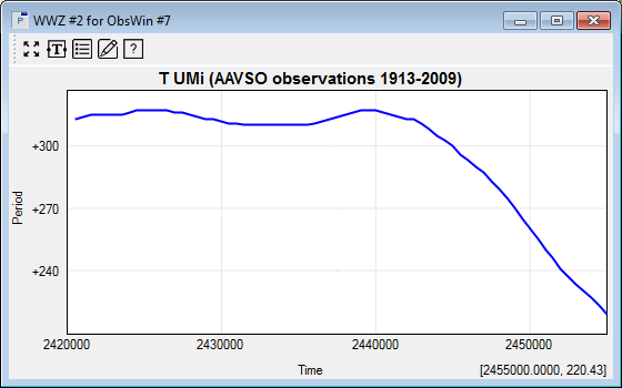
This is done by looking at the evolution over time of the maximum WWZ values and is further explained in tutorial 5 Detecting period evolutions using WWZ. Below is an example of a Period Window showing how the Period of T UMi evolves over Time. It essentially shows the evolution of the peak-period values, which in the above WWZ Period Window, correspond with the 'dominant' section of the color map.
|